If you're looking forward to changes that come with starting a new year, you may also be excited to learn what sorts of trends are emerging in the web design world. What most people aren't talking about, but should be, are the types of design trends that are on their way out, which ones should be left out and those that are unlikely to be seen again after the frosty morning of January 2nd. Here are a number of styles that are dying out fast. Some are bad design, but many of the following have merely fallen in favor because they shined a little too brightly in 2013.
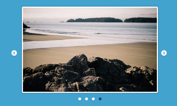
Homepage Sliding Banners
These eye-catching banners seemed like a great idea once upon a time. They're brightly colored, show visitors a wealth of information and have the appearance of being interactive. Most people, however, find them more distracting and annoying than anything else, so they're falling quickly in favor of more truly interactive and less gaudy design, like single-page scrolling and simple drop-down menus.

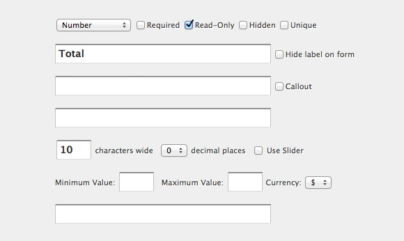
Extensive Fill-Out Forms
Getting a user's information is essential for certain aspects of running an online business, whether it's an e-commerce site or a simple blog that has a contact form. But the days of seeing a full page of questions, extending into optional areas that visitors now intentionally skip for fear of offering information that is used purely for marketing is on the wane. Asking tons of questions only serves to alienate possible customers, and fortunately websites seem to be realizing that.

Circular Script Logos
Using a script font within a circle, either outlined or filled in, monogram or full title, used to be the height of cool logo design, but so many people used this look, including individuals on their personal websites as well as professional companies, people became completely burned out by it. There may be a resurgence of this style some day, but it's safe to say most are steering clear of this overused badge.

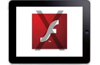
Flash Intros
Remember these attention grabbers? Flash intros can still be found here and there on ostentatious and out of touch websites that haven't updated their look, but for the most part people have moved on to simple design and limited features. Videos are great, and flash paved the way for them, but the music and animation just seem to annoy visitors now, who want more control when they're surfing and fewer surprises.
Too Many Fonts
Everyone knows typography is important, and it's a lot of fun to play with, but it's essential that you show restraint when using typefaces on logos, websites and business cards. It's particularly obvious when someone without graphic design experience develops a site, as they tend to complicate the look with a stunning array of various fonts. Fortunately, even amateurs are learning to scale back and use no more than two, maybe three fonts at the most.

Complicated Design
If you thought having lots of icons, design elements, fonts and features means you have an exciting and interactive site, you might be right, but the overall look is overwrought and overwhelming. As design trends move forward, they're moving away from complex to simple for a more enjoyable browsing experience. You don't want visitors confused or lost; you just want them to think your work is beautiful. You're unlikely to see complicated successful websites in 2014.
Discovering the highly anticipated trends of the New Year has everyone buzzing, but it's just as important to see from where the styles are moving. Though some of these features were once incredibly popular, they've suffered the ultimate fate of rising to the top: total saturation. And that means fatigue. Watch out for overly popular and overly hyped designs in 2014, or they may end up in a list just like this a year from now.
Related Posts
Here's some other articles that you will definitely find useful.


No comments:
Post a Comment