|
Wednesday, July 31, 2013
Reminder: Check out Lakshman's photos on Facebook
Tuesday, July 30, 2013
Web Design and Mobile Trends for 2013 eBook: download it for free!
It's finally here! A few months ago we began this rewarding project, the idea of which was to shed a bit of light on this period when everything seems to be born again and it's difficult to predict how it will evolve.
We decided to ask a selection of outstanding professionals in the sector about their vision for the future of web technologies, design for different devices and how it might evolve, as well as the social repercussions and uses of these technologies.
28 notable characters such as Jeffrey Zeldman (A List Apart), Karen McGrane, Aarron Walter and Veerle Peters, and agencies like B-Reel, Unit9, Fi, HinderlingVolkart or Ultranoir have helped us understand the current situation and learn how they approach their projects from this complex multidevice point of view.
The result is an easy-to-read publication, made up of short interviews which can be approached separately, with an informal touch. How to get it? It's easy, just Tweet and download!
The publication collects many reflections on current topics like
responsive images and layouts, preprocessors, influence of mobile devices, performance, content strategy, new ways of interaction and visual trends for web and mobile design for 2013.
.pdf, .epub, .mobi and .azw3 versions are available so you can read it on your iPad, Kindle and a wide range of devices and ereaders. Enjoy it and let us know what you think!
10 Web Design Trends for 2013
For starters, we'd like to say thank you for the amazing reception our free eBook Web design and Mobile Trends for 2013 has had since its launch last week, and especially to all those who made it possible by sharing their insightful opinions.
Today we're doing a review of the end conclusions, where we will identify and analyze 10 of the key trends. This is just a brief overview of the conclusions you can read in the book. In fact, we have now released an updated version of the eBook in PDF format, which includes a few corrections and a new layout for an easier and more enjoyable reading experience.
-
What will be those key trends?
- 1. CONTENT FIRST
- 2. SIMPLICITY OF DESIGN INTERACTION AND CONTENT
- 3. UX CENTERED DESIGN
- 4. APP STYLE INTERFACES
- 5. THE UNIFICATION OF DESKTOP AND MOBILE INTO A SINGLE VERSION
- 6. SVG AND RESPONSIVE TECHNIQUES
- 7. FLAT COLORS AND NO MORE SKEUOMORPHISM
- 8. TECHNOLOGY AGNOSTIC
- 9. EXPERIMENTATION AND INNOVATION IN DEVICE SENSORS AND INTERACTION
- 10. THE INTERNET OF THINGS
It's no easy task putting together a short summary of all the interviews, but as far as we're concerned, there are a few memorable statements in the book which nicely encapsulate the conclusions we've come to:
Bruce Lawson:"If I go to a train website, I don't really want to see a picture of Richard Branson smiling at me, I don't want to read the Chief Exec's ambitions and life history. All I want to know is what time my train is and how much it is."
Karen McGrane:"Mobile is not the Lite version. You don't get to decide which device people use to visit your website. They do."
Simon Foster:"I always keep it in mind that no matter how beautiful I make a website the average user only really wants to spend about 10 seconds on it."
This project reveals the need to prioritize content and the user's point of view. Almost all the participants expressed concerns about accessibility and application performance across the multiple devices that exist today and will only continue to increase in number. This wasn't the case a few years ago, as Rachel Andrew points out:
"We were all saying 'in a few year's time we're going to have massive screens and all this space and people are going to have really fast connections' and what's happened is we've all ended up on tiny little screens with crappy bandwidth."
So years ago the tendencies would have been very different. We would have been focusing more on development of visual effects, animation etc...But the future is unknowable.
We have to reach our target users, wherever they live, whatever device or browser they use, and serve them our content in the most efficient way possible. Though this is what web standards evangelists have been shouting from the rooftops for years.
All the trends discussed here are interdependent and fundamentally defined by three principles:Content oriented, UX-centered and Simplicity, which make up the new paradigm we'll need to work with when we come to face the deluge of devices that's looming on the horizon.
-
1. Content First
Content-first will be the center of the galaxy. Content is the most talked-about term in the book. In the coming months we'll see deep debate about how content should be presented to the user and whether or not we should adapt it to the device.
In any case, this should be our main concern. We need to create efficient, searchable, accessible, multi-platform content and make sure it reaches the user via the best interactive experience possible.
2. Simplicity of Design Interaction and Content
Simplicity is the new paradigm. The process of simplification will be the only tool we have to make content accessible and readable on the greatest possible number of devices, with the best user experience. Content strategy, UX, Usability, Accessibility and Visual Design must all be guided by this new paradigm.
3. UX Centered Design
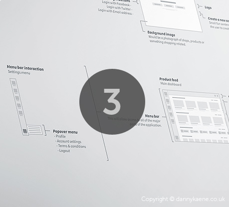
The user's point of view and their experience of using the site and its content is what is ultimately important. All participants agree on simplification on a visual and interaction level. Traditional websites will continue to adopt mobile app UI patterns precisely because they offer a more simple and efficient user experience, which brings us to the next point, "App Style Interfaces"...
4. App Style Interfaces
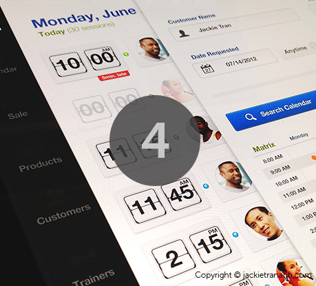
Over the next few months we're going to witness a process of transformation for most desktop websites, which will increasinglyimitate the style and interfaces of mobile apps, unifying and simplifying content and design and at the same time facilitating the creation of responsive projects.
5. The unification of desktop and mobile into a single version
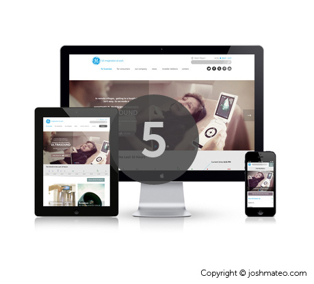
Responsive, Adaptative Content, Mobile First, Device Agnostic, Resolution Independent; all these terms are evolving towards a common destination which is the unification of desktop and mobile into a single version. But how to integrate apps and experiences through multiple devices?
Our experts foresee an evolution in responsive. The trend until now has been to adapt content, but many voices now argue for unification.
-
6. SVG and Responsive Techniques

The search for multi-platform versions and cross-platform technologies will lead to responsive techniques such as SVG, webfonts, design with typography and icon fonts evolving and becoming more widespread, and on a visual level we'll see trends like the ones coming up in the next point...
7. Flat Colors and no more skeuomorphism
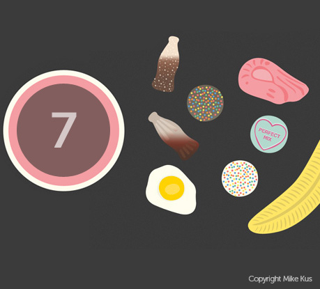
The main visual trends identified by our participants were simplicity, minimalism, clear layouts, app-style interfaces, design focusing on typography, less decoration, less skeuomorphic interfaces, flat style, flat colors... This exact trend towards simplification in design and seemingly aesthetic matters, such as flat colors, responds to the need to create adaptative projects and serve images and scalable elements to retina displays with excellent performance on 3G connections, but also to mobiles with inferior provisions from the non-western market and to devices such as eReaders.
8. Technology Agnostic
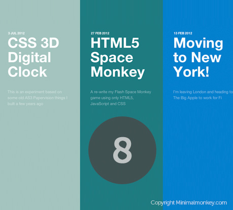
Technology agnostic, of course, is the main idea.
In web standards based applications, looking at the data graphic below we can see that theHTML/ CSS/ Javascript trio is the "primordial soup". We then havelots of CSS in its various forms, custom filters, CSS Effects, 3D Transforms, Preprocessors andtechnologies such SVG or webfonts related to responsive techniques. It's worth pointing out the growing interest in Javascript for web app development, but when it comes to effects, animation, filters etc., it will step aside to make way for the new capacities of CSS3.
In server-side languages Ruby and Python and experimentation with Node.js are becoming more widespread. The multiplicity of frameworks and builders will be another constant.
On the other hand we have the development of native apps for iOS and Android, where there's nothing new either, just the intense and continual increase in demand and the desire to have more suitable cross-platform technologies, based on web standard technologies or otherwise. The spread of Android means demand for Android apps seems to be gaining in importance.
Another thing that really stands out is the growing interest in WebGL, particularly among the big agencies. This technology is raising high expectations thanks to its performance and the potential it offers on an experimental level.
9. Experimentation and innovation in device sensors and interaction
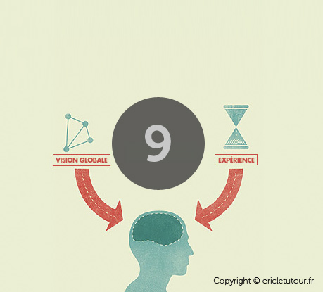
It will be a time for getting the best out of mobile technology and creating new user experiences, exploring device sensors and experimenting widely with touch-enabled-interfaces, speech-based, etc.
10. The internet of things
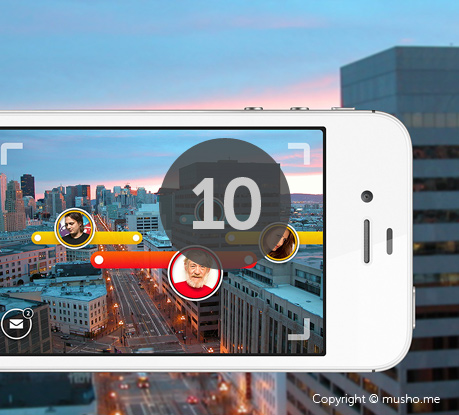
Soon we'll be able to communicate not only with our fridges and televisions, but even with devices with tiny LED screens, In-kitchen devices, In-car audio interfaces... Hundreds of totally different platforms will spring up. Without a doubt, interactive TV will have a leading role. How will we be able to evolve towards a rational unification of all this?
As Aarron Walter says, we'll see an "Ecosystem of connected services" and we'll have to work hard on integrating services and user accounts.
Well, that's it for our humble account of what will be happening in the next year, and as we say at the end of the book:
"These conclusions won't be anything like the reality, because at this very moment some anonymous genius is probably giving form to a new technological revolution."
-
Data visualization. Web Design Trending Terms
The following images are a visual representation of Trending Terms, the most frequently mentioned terms throughout this project. These data visualizations allow us to gain an overall vision of the visual and technological web design trends for this year.
Bootstrap 3 Goes Mobile-First, Now Reportedly Powers 1% Of The Web
Bootstrap 3
Sleek, intuitive, and powerful mobile-first front-end framework for faster and easier web development.
-------------------------------------------
Sleek, intuitive, and powerful mobile-first front-end framework for faster and easier web development.
New organization
We've mentioned it a few times in previous updates, but today it's Facebook Official: Bootstrap has moved to @twbs/bootstrap. Watchers, stars, and the like are all maintained in the move, as is all Git history. New digs, same code.
Docs for v3 and v2.3.2
With today's release we're pushing forward 100% on Bootstrap 3, meaning when you head to http://getbootstrap.com you'll see the v3 RC1 documentation. Our intention is to make BS3's testing and development as widespread as possible so we get the best final release possible.
Head on over to http://getbootstrap.com to check it out. If you're running into any broken links on the downloads, give it a bit for the DNS to sort itself out.
We're fully aware everyone cannot simply jump right into BS3 yet, so we've kept the docs for 2.3.2 around for easy access. You'll find a prominent link to the old docs in all of BS3's documentation. If you're in need, head over tohttp://getbootstrap.com/2.3.2/.
What's changed!?
With over ~1,600 commits, ~72,000 additions/deletions, and ~300 files changed,everything has changed. We've added features, removed features, and cleaned up a lot more. The v3 pull request on GitHub has all the details you'll need for a complete list of changes and some helpful migration tips.
Onward to RC2
Bootstrap 3 RC1 is just the start, and we need your help to get to RC2. Download it and give it a go, and most importantly, tell us what you find. If something new is all funky or you found a bug, let us know by opening a new issue.
________________________________________________________________________________
The team behind Bootstrap, the immensely popular grid-based, front-end framework for web development, launched the first release candidate of Bootstrap 3 includes over the weekend. Besides a tweaked look and a couple of new features (and also the removal of a few others), the most important change in this update is that Bootstrap, just like its close competitor Foundation, is now mobile first and responsive by default. The announcement coincided with new data from source-code search engine meanpath, which also this weekend announced that 1 percent of the 150 million websites in its index now use Bootstrap.
Bootstrap, which was developed at Twitter but has since been spun out into its own organization after its developers left the company, has clearly caught on with developers, who can easily set up a good-looking site without having to involve designers or worry about how the site will look on different browsers.
 My guess is that the vast majority of those 1 percent of sites are run by startups. The problem with this, of course, is that if you spend enough time looking at startup landing pages (which most of us here at TechCrunch are contractually obliged to do), it often feels like they all look alike after a while because the majority of developers all built the same generic Bootstrap-powered site.
That said, version 3 introduces a new flat look for a few design elements that makes it stand apart from version 2 sites. In total, the development team made over 72,000 additions and deletions and changed 300 files between the last version of Bootstrap 2 and this first release candidate.
By going mobile first, Bootstrap now asks developers to first think about the mobile site and then think about how it expands to larger screens. Previously, the thought process was the other way round, with developers working from the 12-column desktop grid down to smartphone-sized screens. In the process, the team also changed some naming schemes and added features like retina image mixins and small grid systems for tablets and phones.
If you're currently using Bootstrap 2, switching to Bootstrap 3 should be relatively easy, but given how much of the code has changed means you can't just drop in the new files and hope everything will work.
-----------------------------------------------------------------------------------------------------------------
10 Awesome Weather Widgets with jQuery
Today we are sharing you our collection of what we think awesomely good jQuery Weather Widget plugins. We can easily provide our website's visitors the weather information of any location with these plugin integrated into our site. These plugins uses the API of weather information providers like Google and Yahoo!
Related Posts:
1. WeatherSlider – jQuery animated weather widget
This is a beautiful weather slider widget with animated weather effects and 48 weather types.

SourceDemo
2. My Google Weather Plugin
This plugin adds weather for any city in the world.
FEATURES:
> Fully customizable weather widget
> Use google provided weather information
> Available in most cities in the world
> Cross-browser (works in IE7+ / FF / chrome / Safari / opera)

Source + Demo
3 Create a Weather Widget Using jQuery, YQL and Weather.com
Create a simple widget to display weather data. Our aim is to create a widget similar to how Google displays weather data.

SourceDemo
4. Using Google's Weather API
This application takes a set of Google weather API feeds and makes some simple decision based on the output.

SourceDemo
5. jQuery Geolocation and Yahoo's APIs to build a simple weather webapp
We will be using the HTML5 geolocation API to present the user with a personalized weather forecast. Using jQuery, we will issue AJAX request to two of Yahoo's popular APIs to obtain additional geographical information and a weather forecast.

SourceDemo
6. jQuery weather widget
This widget is pure JavaScript and requires no back-end/server so you can place it on your blog or anywhere you like. The widget makes two main calls using JSON to retrieve the users geolocation and then to retrieve the local weather for that location.

Source + Demo
7. jDigiClock : jQuery Digital Clock with Weather
jDigiClock is a jQuery plugin that has been inspired from the distinctive HTC Hero Clock Widget.

Source + Demo
8. simpleWeather : How to display weather with jQuery
A simple jQuery plugin to display the weather information for any location. The data is pulled from the public Yahoo! Weather feed via the YQL API.

Source + Demo
9. Adding Weather to Your Site with jQuery and YQL
jQuery and YQL (a free web service offered by Yahoo) can be used to easily add a customized weather display to your site. In this article I'll guide you through the process from start to finish.

SourceDemo
10. zWeatherFeed – Yahoo! Weather plugin for jQuery
This plugin will read the current weather for a location using Yahoo! Weather. It produces structured HTML with in-built CSS classes for styling. Simple and easy to use.

SourceDemo
Friday, July 26, 2013
Uniform - Sexy forms with jQuery
Have you ever wished you could style checkboxes, drop down menus, radio buttons, and file upload inputs? Ever wished you could control the look and feel of your form elements between all browsers?
If so, Uniform is your new best friend.
Uniform masks your standard form controls with custom themed controls. It works in sync with your real form elements to ensure accessibility and compatibility. For truly complex designs, you can import multiple themes on one page.
Download
Uniform styles:
- Selects (drop down lists)
- Checkboxes
- Radio buttons
- File upload inputs
- Input areas (single line text)
- Textareas (multi-line text)
- Links
- Buttons, including form submit and reset buttons
- Selects (drop down lists)
- Checkboxes
- Radio buttons
- File upload inputs
- Input areas (single line text)
- Textareas (multi-line text)
- Links
- Buttons, including form submit and reset buttons
Tested & Compatible in:
- Safari 3+
- Firefox 3+
- IE7+
- Chrome
- jQuery 1.3+
- Opera 10+
- Degrades gracefully in IE6
- Safari 3+
- Firefox 3+
- IE7+
- Chrome
- jQuery 1.3+
- Opera 10+
- Degrades gracefully in IE6
Uniform
Sexy form elements with jQuery. Now with HTML5 attributes!
Version 2.1.1
Works well with jQuery 1.6+, but we've received patches and heard that this works with jQuery 1.3.
Licensed under the MIT License
Installation
Installation of Uniform is quite simple. First, make sure you have jQuery installed. Then you'll want to link to the jquery.uniform.js file and uniform.default.css in the head area of your page. Here's what your <head> tag contents should probably contain:
<!-- Make sure your CSS file is listed before jQuery --> <link rel="stylesheet" href="uniform.default.css" media="screen" /> <script src="http://ajax.googleapis.com/ajax/libs/jquery/1.8/jquery.min.js"></script> <script src="jquery.uniform.js"></script>This relies upon a copy of jquery.uniform.js, uniform.default.css and the various images all being available on your webserver.
Basic usage
Using Uniform is easy. Simply tell it what elements to style:
// Style all <select> elements $("select").uniform();To "uniform" all possible form elements, just do something like this. Things that can't get styled appropriately will be skipped by Uniform.
// Style everything $("select, input, a.button, button").uniform();You can exclude elements too by using more jQuery selectors or methods:
// Avoid styling some elements $("select").not(".skip_these").uniform(); // Method 1 $('select[class!="skip_these"]').uniform(); // Method 2A complete set of tags in the HEAD section of your site can therefore look like this:
<!-- Make sure your CSS file is listed before jQuery --> <link rel="stylesheet" href="uniform.default.css" media="screen" /> <script src="http://ajax.googleapis.com/ajax/libs/jquery/1.8/jquery.min.js"></script> <script src="jquery.uniform.js"></script> <script type='text/javascript'> // On load, style typical form elements $(function () { $("select, input, button").uniform(); }); </script>Extra parameters
You can pass in extra parameters to control certain aspects of Uniform. To pass in parameters, use syntax like what is seen here. This only changes the settings for the elements that are actually uniformed in this particular call.
$("select").uniform({ param1: value, param2: value, param3: value });There is a separate listing of global defaults. You access them by using the defaults property. Note: This property name changed in v2.0.
$.uniform.defaults.checkedClass = "uniformCheckedClass"; $.uniform.defaults.fileBtnHtml = "Pick a file";Uniform v1.x had a bug where setting values in the call to .uniform() also potentially reset the defaults and redrew other uniformed objects with new settings. As of version 2.0.0 the global defaults are now completely separate from the settings passed to every .uniform() call. Extra parameters defined when instantiating Uniform are not global and can't be recalled from $.uniform.defaults later.
activeClass (string)
Default: "active"
Sets the class given to elements when they are active (pressed).
$("select").uniform({activeClass: 'myActiveClass'});autoHide (boolean)
Default: true
If this option is set to true, Uniform will hide the new elements if the existing elements are currently hidden using display: none.
If you want to show a select or checkbox you'll need to show the new Uniform div instead of the child element.
buttonClass (string)
Default: "button"
Sets the class given to a button that's been Uniformed
$("input[type=button]").uniform({buttonClass: 'myBtnClass'});checkboxClass (string)
Default: "checker"
Sets the class given to the wrapper div for checkbox elements.
$(":checkbox").uniform({checkboxClass: 'myCheckClass'});checkedClass (string)
Default: "checked"
Sets the class given to elements when they are checked (radios and checkboxes).
$(":radio, :checkbox").uniform({checkedClass: 'myCheckedClass'});disabledClass (string)
Default: "disabled"
Sets the class given to elements when they are disabled.
$("select").uniform({disabledClass: 'myDisabledClass'});eventNamespace (string)
Default: ".uniform"
Binds events using this namespace with jQuery. Useful if you want to unbind them later. Shouldn't probably need to be changed unless it conflicts with other code.
$("select").uniform({eventNamespace: '.uniformEvents'});fileButtonClass (string)
Default: "action"
Sets the class given to div inside a file upload container that acts as the "Choose file" button.
$(":file").uniform({fileButtonClass: 'myFileBtnClass'});fileButtonHtml (string)
Default: "Choose File"
Sets the text written on the action button inside a file upload input.
$(":file").uniform({fileButtonHtml: 'Choose …'});fileClass (string)
Default: "uploader"
Sets the class given to the wrapper div for file upload elements.
$(":file").uniform({fileClass: 'myFileClass'});fileDefaultHtml (string)
Default: "No file selected"
Sets the text written in the filename div of a file upload input when there is no file selected.
$(":file").uniform({fileDefaultHtml: 'Select a file please'});filenameClass (string)
Default: "filename"
Sets the class given to div inside a file upload container that spits out the filename.
$(":file").uniform({filenameClass: 'myFilenameClass'});focusClass (string)
Default: "focus"
Sets the class given to elements when they are focused.
$("select").uniform({focusClass: 'myFocusClass'});hoverClass (string)
Default: "hover"
Sets the class given to elements when they are currently hovered.
$("select").uniform({hoverClass: 'myHoverClass'});idPrefix (string)
Default: "uniform"
If useID is set to true, this string is prefixed to element ID's and attached to the container div of each Uniformed element. If you have a checkbox with the ID of "remember-me" the container div would have the ID "uniform-remember-me".
$("select").uniform({idPrefix: 'container'});inputAddTypeAsClass (boolean)
Default: true
When true, <input> elements will get a class applied that is equal to their "type" attribute.
$("input").uniform({inputAddTypeAsClass: true});inputClass (string)
Default: "uniform-input"
Applies this class to all input elements when they get uniformed.
$("input").uniform({inputClass: "inputElement"});radioClass (string)
Default: "radio"
Sets the class given to the wrapper div for radio elements.
$(":radio").uniform({radioClass: 'myRadioClass'});resetDefaultHtml (string)
Default: "Reset"
This text is what's shown on form reset buttons. It is very similar to submitDefaultHtml.
$("input[type='reset']).uniform({resetDefaultHtml: "Clear"});resetSelector (boolean/string)
Default: false
This parameter allows you to use a jQuery-style selector to point to a "reset" button in your form if you have one. Use false if you have no "reset" button, or a selector string that points to the reset button if you have one.
$("select").uniform({resetSelector: 'input[type="reset"]'});selectAutoWidth (boolean)
Default: true
If this option is set to true, Uniform will try to fit the select width to the actual content. When false, it forces the selects to all be the width that was specified in the theme.
When using auto widths, the size of the element is detected, then wrapped by Uniform and expanded to fit the wrapping.
If you want to specify a size of a select element and then have Uniform wrap it appropriately, there will be some difficulty. The size of the element needs to get detected and then will be changed by Uniform. For this to happen, it is suggested you do one of these solutions when you have issues.
- Set a custom inline width for the element (
<select style="width:XXpx">) - Use two css rules;
select { width: XXpx }and.selector select { width: 100% }
If the select is empty and later populated via JavaScript, you can do one the following:
- Set a custom inline width for the element (
<select style="width:XXpx">) - Uniform the element after it was loaded with options
- Use
$('select').uniform.restore().uniform()to reapply Uniform to the selects that change
selectClass (string)
Default: "selector"
Sets the class given to the wrapper div for select elements, but not multiselects.
$("select").uniform({selectClass: 'mySelectClass'});selectMultiClass (string)
Default: "uniform-multiselect"
Sets the class given to the wrapper div for select elements that are multiselects.
$("select").uniform({selectMultiClass: 'myMultiSelectClass'});submitDefaultHtml (string)
Default: "Submit"
This text is what's shown on form submit buttons. It is very similar to resetDefaultHtml.
$("input[type='submit']).uniform({resetDefaultHtml: "Submit Form"});textareaClass (string)
Default: "uniform"
The class that is applied to textarea elements.
$("textarea").uniform({textareaClass: "myTextareaClass"});useID (boolean)
Default: true
If true, sets an ID on the container div of each form element. The ID is a prefixed version of the same ID of the form element.
$("select").uniform({useID: false});wrapperClass (string)
Default: null
When uniforming, the top level element that wraps the input is given this class. When elements would not normally be given a wrapper element, this option will create a wrapper element anyway. This can really help with running multiple themes on a single page.
$('input.blue').uniform({wrapperClass: "blueTheme"}); $('input').uniform({wrapperClass: "defaultTheme"});Additional Functions And Properties
In addition to the parameters, there are a couple of other ways you can interact with Uniform.
$.uniform.update([elem/selector string]);
If you need to change values on the form dynamically you must tell Uniform to update that element's style. Fortunately, it's very simple. Just call this function, and Uniform will do the rest.
$.uniform.update("#myUpdatedCheckbox");If you don't mind updating all Uniformed elements or just don't specifically know which element to update, you can just leave out the parameter (see below) and Uniform will update all Uniformed elements on the page:
$.uniform.update();$.uniform.restore([elem/selector string]);
If you want to "un-uniform" something, simply call this function. It will remove the inline styles, extra dom elements, and event handlers, effectively restoring the element to it's previous state.
$.uniform.restore("select");$.uniform.elements[]
You can get an array of all the elements that have been Uniformed at any time using this public variable. I don't advise changing the contents!
var uniforms = $.uniform.elements;Customizing CSS
To edit the CSS of Uniform it is highly recommended to not edit the theme files, but to override them using CSS. Make sure your CSS file comes after the Uniform theme css file in the HEAD section.
It's common to want to resize the selects or other elements. The best way is to set the width property on the div element, span element and the form element itself. Resizing "select" lists is a bit tougher as you need to change the line height. I suggest looking at the _base theme's SCSS file to see where the various width and height variables are used.
If you'd like to create your own theme, take a peek at theme-kit/README.md. It's on github and included in the theme kit.
Tips & Tricks
Uniform is supposed to be pretty simple, but there are a few things that can be tricky. Here are some tips that may make your experience simpler:
Remember to change the CSS classes in the theme if you change the parameters for elements' classes. This can be tedious work, but if you don't do it, it's not going to look correct. Find and Replace is your friend.
Uniform cannot automatically sniff out dynamic value changes. If you make changes to elements in JavaScript or using a reset button of some kind, remember to call $.uniform.update(); to sync the changes with Uniform. See Issue #270 for the little bit of code you will need.
Likewise, when you add elements to the DOM, perhaps via AJAX, and they need to get styled, you will need to use $('#newElement').uniform() on it so the styling is applied.
Uniform is disabled in IE6. It's not possible to fix due to the way IE6 handles form elements. If you care about IE6 users, give it a quick look to make sure your "naked" form elements look alright in there.
There is a bug in Safari 5.1 that will cause the web rendering process to crash when you use custom fonts. For more information, see Issue #183.
With IE 7-9, sometimes the "change" event doesn't get fired or doesn't get triggered at the right time. When we detect a change, Uniform may submit its own "change" event on the element. See Issue #152 and Issue #238.
With IE9, you may have problems with some fonts on your site. See Issue #226 if you mysteriously see a blank page or blank form elements. The fonts in Uniform have been arranged to work around this, but custom themes may not work properly.
If you have ideas, or bugs, please post them in GitHub. We rely on our users' for improvement ideas and bug reports. Without your participation, Uniform will stay static.
If you are having problems with automatically sized select elements in Firefox, double check and ensure your CSS files are listed before jQuery, Uniform and your code that uniforms the form elements. Also check the selectAutoWidth property's documentation.
Upgrading To 2.0 And Later
Your sprite map will now support many new things and will need to be updated. If you use custom backgrounds that are not in the sprite map, those will need updating as well.
The uniform.options object was renamed to uniform.defaults since they are the default options. Other properties were renamed to be consistent or have less ambiguous names, such as fileBtnClass becoming fileButtonClass.
Previously, calls to update() would render all elements with the most recent set of options. This has been fixed, but may change how your page looks. Test to make sure things still render as expected.
$.uniform.noSelect is no longer exposed and has been updated to version 1.0.3.
$.uniform.restore() does not need to be global; you now can use $('#myId').uniform.restore() instead to just restore some elements. Same thing for updates.
The sprite changed a bit. The caps for select lists were moved to the left-hand side. Button theming was added and the file upload images were reordered to match the select list order. See the theme-kit/README.md file for further reading on this topic.
Reporting Bugs
It sure would be handy if you could create a test page to help illustrate bugs. When you use the GitHub Issue Tracker, you could clone this bug template gist or use this jsfiddle to help illustrate your point.
Even if you don't do that, all sorts of feedback is welcome, but narrowing down your problem or providing an example would immediately help narrow down the problem quickly.
Themes
Theming is central to the philosophy of Uniform. We don't want you to feel limited to just using the default style. You can design your own theme with our theme kit. Most of the CSS can be generated by editing a SCSS (a variant of SASS) file and then running make.
You can also download themes created by others. Here are some of our favorites:
 | Uniform Default | by Josh Pyles | Download |
 | Aristo | by 280North / ported by Josh Pyles | Download |
 | Agent | by Collin Allen | Download |
Submit your theme by opening a new issue. We'll welcome the addition!
Contribute
Have ideas for Uniform? Want to submit a bug fix or patch? We collaborate on Uniform on GitHub, and we welcome you to join us as well! Visit Uniform on GitHub.
Thursday, July 25, 2013
30 Free Toggle Switches UI Elements (PSD)
A toggle switch is a hinged switch that can assume either of two positions, such as an on/off button. It is a switch which is used for breaking or connecting and electrical circuit, such as that present on a switch-board. Toggle switches are now playing a part in the web designing and development industry as they are being used frequently as an UI Element. Toggle switches look really cool and help you enhance your design. It is especially useful in places where you want to give the visitors two choices to choose from. These help you spice up your website and make it more attractive and enhance the user experience.
Creating toggle switches from scratch can be a very tough and time consuming task, so this is where PSD files come in handy. The best thing about these PSD is that they are free of cost and easy to incorporate in your designs. They not only save the time and effort one has to spend in creating the toggle switches but also save you some bucks! So if you are looking for free toggle switches PSD files, then you are at the right place as today we have for you a list of 30 Free Toggle Switches UI Elements (PSD).
Buttons And Switches(PSD)

Toggle UI Switches

Raindrop iOS Toggle PSD

On/Off Switch Buttons

Dark Essential Switches & Toggles PSD

Toggle Switch Variations

Sort Switches / Toggles (PSD)

Switch Buttons

Toggle Buttons (PSD)

Free PSD: IOS Toggle

Toggle Switch PSD

Matte Toggle Switch PSD

Psd Toggle Switch UI

Metal Toggle Switch

Toggle On – Off Switch PSD

Toggle Switches PSD

Glossy PSD Toggle Switches UI

Rounded On/Off Toggle

Toggle Switch

Red On / Off Switch

Sweet Little On/Off Switches

Toggle Switches UI PSD

Switches with Lights and Shadows PSD

Slide Switch Freebie

On-Off Toggles

On/Off Switches and Toggles

Toggle Switch UI

Switch

Fancy PSD Slider + Toggles


