Parallax scrolling effects have become an increasingly popular trend in web design. The basic idea of parallax is having different elements scroll along different site lines. This often gives viewers an increased sense of depth in the design. Many web designs are incorporating such parallax elements to add visual interest and intrigue as users scroll down (or across a page). Some sites use it more obviously while others simply use it as a subtle compliment to the overall design. Either way, it's quite an impressive effect and one that should continue to gain popularity as the web experiences become more vibrant and rich.
Showcase of the Parallax Scrolling Effect
Here are 30 amazing websites that utilize the parallax scrolling effect. At the bottom of the post, I've also linked to a few tutorials on how to achieve this effect in your own designs. Enjoy!
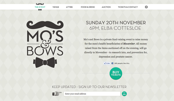
Mo's and Bows
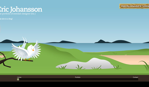
Eric Johansson
TedxPortland
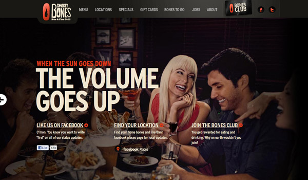
Smokey Bones
Billy's Downtown Diner
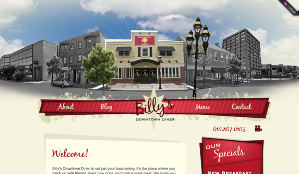
David Beckham

Cultural Solutions
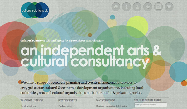
Campaign Monitor

Appmiral
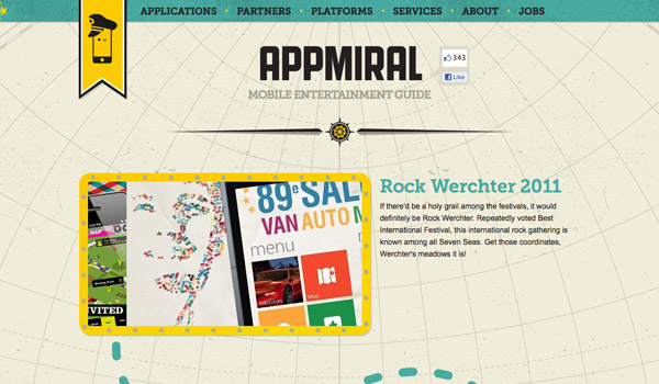
egopop
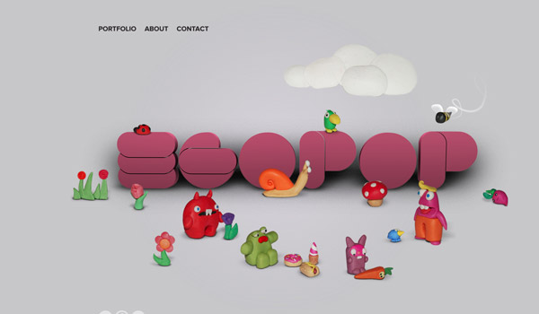
Beer Camp at SXSW
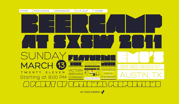
Kisko Labs

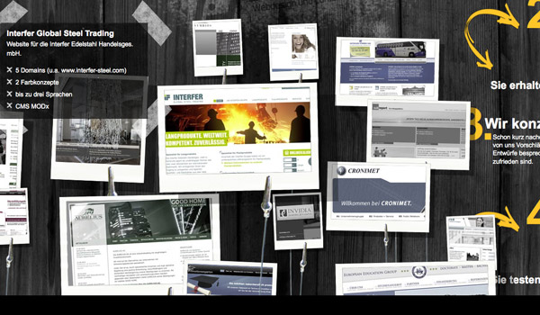
Kontakt & Impressum
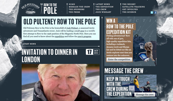
Row the Pole
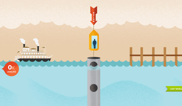
Atlantis World's Fair
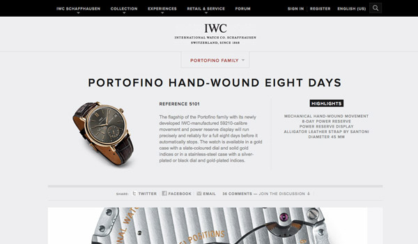
IWC Shaffhausen
Nike Better World

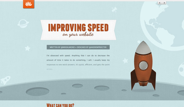
Improving Speed
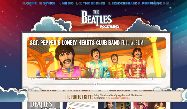
The Beatles Rock Band
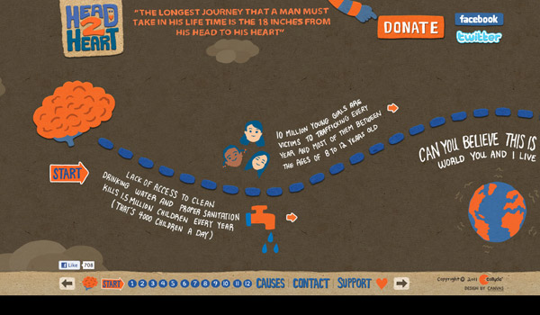
Head 2 Heart
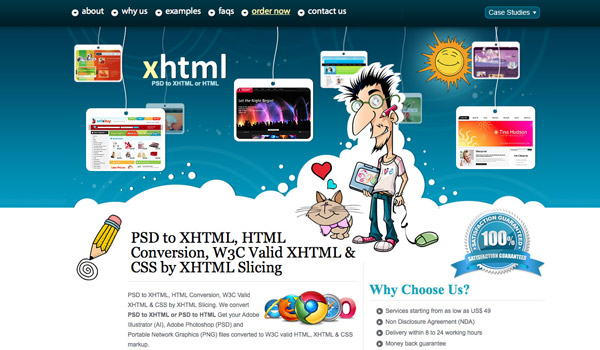
XHTML Slicing
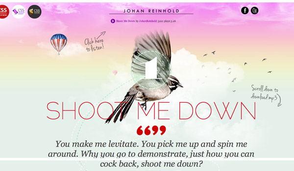
Johan Reinhold
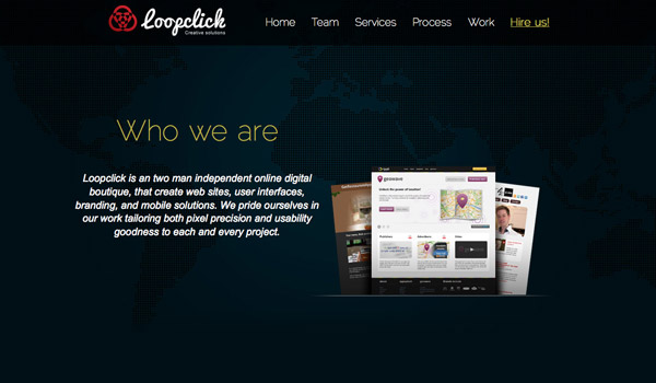
Loopclick
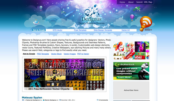
Dezignus
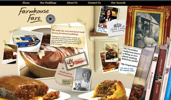
Farmhouse Fare
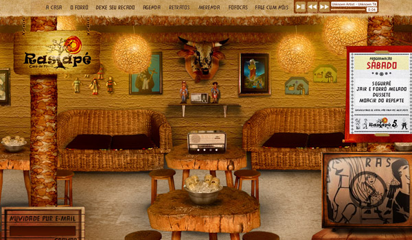
Rastape
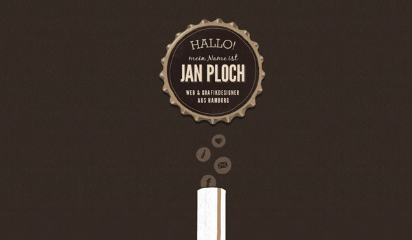
Jan Ploch
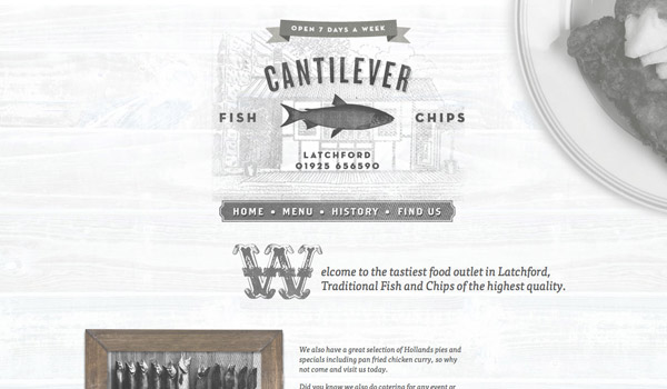
Cantilever Fish & Chips
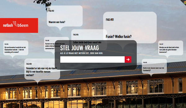
Netlash bSeen
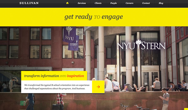
Sullivan NYC
Parallax Tutorials
The following resources will be helpful for those of you looking to achieve the parallax effect in your own designs. Feel free to add additional resources and questions in the comments section below.

No comments:
Post a Comment