Designers have voiced questions over whether this is a lasting trend or just another passing fad. Regardless of the future and the voices against flat, most designers have been tempted to try implementing this trend in some of their work. Here we'll delve a little deeper into the style, its historical roots and how to start designing in the flat style right away.
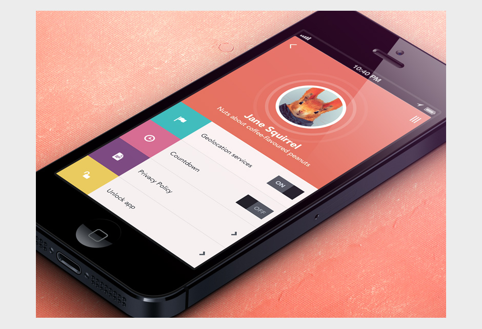
As the name indicates, flat design is defined by flatness of style: simplifying an interface by removing extra elements such as shadows, bevels, textures and gradients that create a 3D look.
The idea is to create a finished design that lives in only two dimensions, without losing any of the functionality that a "regular" interface provides. This creates a new challenge for the designer, because by stripping an interface of its decorations and effects, it becomes harder to define the main actions and elements in a design.
Flat design comes from the wish to create more digital interfaces, and an open canvas for interface innovation in digital devices. A good example of flat design is this icon design collection for Mac OSX, where some of the most famous Mac icons are re-imagined as flat versions of themselves. You can easily see how the icons maintain their style and form even though they're stripped of details, shadows and textures.

Evolution of Flat Design
Historically, in design as in fashion, trends tend to shift continually between the complex and the simple. This is becoming more obvious in the visual design field, especially in web and multimedia, where designs are more ephemeral and don't last as long as in traditional print supports.
The term "Flat Design" was coined and popularised by Allan Grinshtein, from LayerVault,a Version Control for Designers. In his post "The Flat Design Era", Allan explains that "elegant interfaces are ones that have the most impact with the fewest elements". The idea is that a minimalistic interface can be better suited to its function when compared to a more embellished, complex one. The community took this on board, having being bombarded with skeuomorphic interfaces over the past year.
Since then, flat design has come on in leaps and bounds. Most flat design schemes have five characteristics – no added effects, simple design and UI elements, a focus on typography, a focus on color and an overall minimalist approach. You can find out more about these characteristics in Designmodo's post on the Principles of Flat Design. You might also want to check out the Flat UI Free Interface Kit.
Flat Design and Microsoft
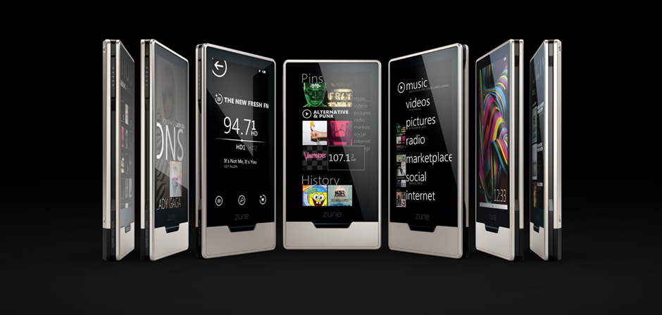
The biggest player in Flat Design, and the first to bring this style to the forefront, was Microsoft. In 2006, Microsoft launched the Zune music player. It was expensive, applied DRM to your music files and was a commercial flop. But even though Zune wasn't commercially successful, it was a first step in defining the rest of Microsoft's design for years to come. Zune's interface was minimalistic, with a focus on light and big typography, and an interface free of surplus details and elements.
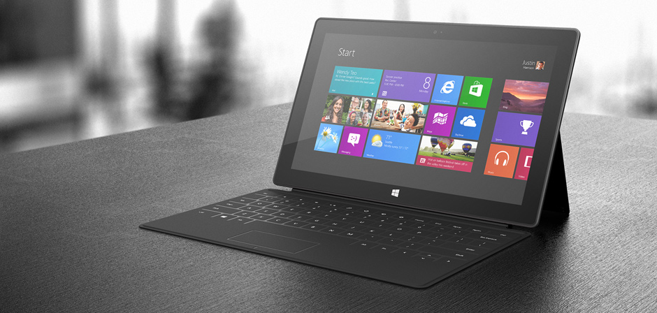
From 2006 to today, Microsoft has used Zune as a foundation to develop its image and visual interface, becoming cleaner and flatter. Other products from Microsoft also influenced this style, such as the Xbox 360 dashboard, a square-based interface that used simple iconography and typography. Windows 8 "Metro UI" was probably one of the biggest interface overhauls at Microsoft. Its simple geometric interface was replicated shortly after on the Windows Phone 7, a smaller, mobile version of Windows 8 interface.
How to create a flat design?
Buttons
When creating a button, using a border, gradient and drop-shadow will make the element stand out against the background and content. This makes it easily identifiable as a clickable element.
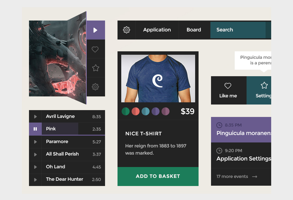
When creating a flat button, you can't use these details, so the focus should be put on grid organization and color contrast. You can use bevel and shadow as long as you keep the flat look of the button, but you'll want to make these controls as simple as possible.

Forms
Forms are a crucial element to get right in a flat design. Text areas, inputs and dropdowns shouldn't use inset shadows as they usually do by default. You can change this by styling the form elements with CSS yourself: see this post on how to create a simple login form and style. Or, if you want to have full control over your elements, try using a plugin that supports themes such as uniformjs and style these themes the way you want, or even create new ones.
Typography
Typography is a very important element in flat design. Since the interface is more minimalistic, you can use typography to help you create the style and mood you're looking for. You can set a mood just by using a custom and specific font with a flat design outline. Since the background is simple, the font will pop out and set the style for itself. See these uses of typography in flat design to inspire you and learn how others are using it to achieve a particular look.
Colors
A fundamental part of designing an interface is defining a color palette. The color schemes used in flat design interfaces tend to be bolder and brighter than some other color palettes. Flat UI Colors was developed with this in mind and is a great place to check out some of the best (and most popular) colors being used in flat design today.
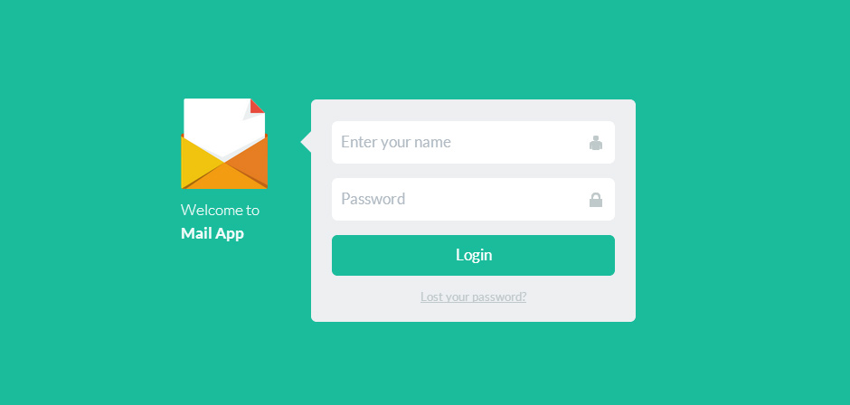
When picking a color palette, remember to think about how colors will help users navigate a site. Be sure to specify a color for the main actions on your website: buttons such as "Submit," "Send," "See More," etc. should all be the same color, ideally a vivid one which will provide a strong contrast with the background. If your logo or brand has a main color, that should be the one used for the main controls. Don't overuse it though, or you risk make it less important in the user's eyes.
You should also choose a secondary button color, usually a light gray. That way you can line up two buttons, for example "Submit" and "Cancel", with "Submit" as the main action and "Cancel" a secondary one. Color choice is especially important in flat design, because when you're using flat buttons, these colors will be one of the main identifiers that help the user recognize them.
Shapes
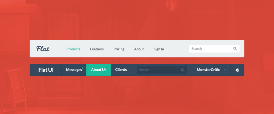
Usually, you'll want to make buttons square or square with rounded corners, depending on the style of the site. You can be more creative and use other shapes such as circles, triangles or even custom shapes, but keep in mind the latter might be a bit more risky. Be sure to maintain consistency throughout your interface controls, and to organize content in such a way that the user will be able to identify and recognize your titles, content and controls.
Below you can see the difference between a regular Twitter Bootstrap button and the same button in a flat style on Flatstrap, a flat version of Twitter Bootstrap. The regular button has rounded corners and a really subtle gradient and drop-shadow, while the flat version is completely stripped of these effects, merely changing to a darker shade on mouse-over.
Where should flat design be used?
Flat design should be used moderately. Even though it's a simple way to create a light and minimalistic interface, it isn't right for every website. For example, flat can be great if you're designing a portfolio, or web tech startup site, but it can be a limitation if you're trying to create something more complex. If you're designing a website for children, you'll probably want to make it flashy and colorful, full of fun elements and animated characters. In the same way, if you're creating a gaming website it should be all about graphics and effects, and the design should be connected to the game.
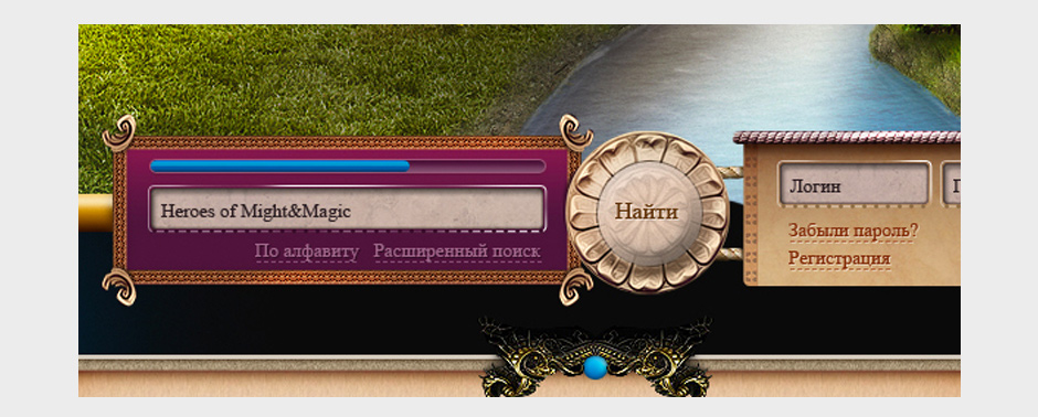
These types of website can be done in flat, but the flat style may end up harming your website. Always keep in mind your target audience and the message you're looking to convey. If flat design can be used while keeping your message clear, use it, but don't make a trend or a visual style more important than your website's content.
Usability is (always) more important than looks
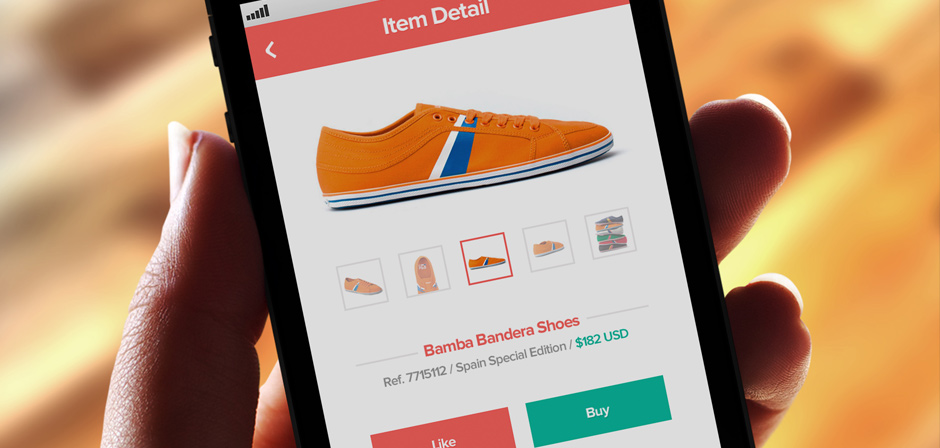
If you've made the decision to create a flat design for your website or product, be sure to test your mockups or prototypes with real people to ensure that your work achieves its objective. You can also try A/B Testing to test two different designs and see which converts more. The main purpose of a web app, mobile app or website should always be to clearly communicate a message and provide a usable and intuitive interface for the user. It's the designer's job tomake sure a certain design aesthetic doesn't hurt usability.
If you create a beautiful design that users can't understand, then you are hurting the product. Trends and styles should always be used in harmony with the objectives of the project. It's easy to lose yourself when creating visual work that's clear in your mind, but at the end of the day, numbers and tests with users are always the best way to know what's really working and what's not. Sometimes a simple change can make a great difference to the user.
So, should I use Flat Design?
Always keep in mind that a trend is only a trend. Try to create a great design, but one that is right for your target user. The priority is to create a functional and usable website, not a good-looking and trendy website. As Wells Riley said in his post Less Aesthetic, More Design, "Design is a form of problem solving. Never forget that."


Web Search Engine Optimization >>>>> Download Now
ReplyDelete>>>>> Download Full
Web Search Engine Optimization >>>>> Download LINK
>>>>> Download Now
Web Search Engine Optimization >>>>> Download Full
>>>>> Download LINK xW